

Two Tone Couches That Work in Real Homes
Maya is standing in a 480-square-foot studio with one window, two thrifted side tables, and a mattress on the floor that has already worn out its welcome. She needs one piece that seats friends after work, gives her sister a place to sleep on weekends, and still looks like it belongs beside the lamp she rescued from a flea market. That’s exactly where two tone couches start to make sense, because one frame can do the job of several mismatched pieces without making the room feel crowded.
A two-tone sofa gives a small room clearer visual jobs. The eye can read one section as the main body, another as the accent, and the whole piece feels lighter than a single block of one color. That contrast also helps a room feel organized when you’re trying to combine seating, sleeping, and storage in the same footprint. For shoppers who want a functional setup with a more deliberate look, the same idea shows up in convertible frames, futons, and sleeper sectionals.
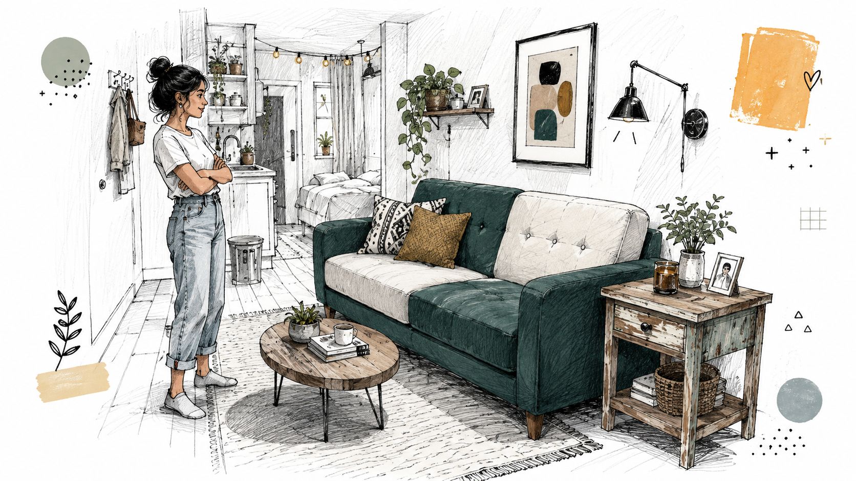
Maya’s kind of room is also where practical furniture choices matter most. Two-tone seating is showing up so often because it solves a very ordinary problem: how to make one piece do more than one thing and still feel intentional.
Why Two Tone Couches Are Showing Up Everywhere
Two-tone seating keeps showing up because it gives a room clear visual order. In an open layout, contrast between the body and the cushions helps separate the sofa from the floor, the rug, and nearby wood finishes without adding more furniture. A first-time buyer can see the effect right away. One piece starts to define the living area and still feels light enough for a small room or a guest space.
The appeal is practical, too. A 60/40 visual split is a useful balance rule to keep the contrast from feeling random. One tone carries the structure, the other does the highlighting.
What the contrast is doing in a real room
A two-tone couch can bridge furniture you already own and a new piece you want to bring in. If your table is warm wood, your curtains are a soft neutral, and your rug has a stronger accent, the sofa can echo one of those tones and help the room feel connected. It does not need to match everything. It only needs to sit comfortably in the same color family.
The format can also hide wear better than a single-color sofa, especially when the high-contact zones are darker or more textured. That matters in family rooms, studio apartments, and rental homes, where the couch gets heavy use every day. A convertible frame or sleeper adds another layer of usefulness, since the sofa has to work as seating first and a bed second.
For lighter rooms, a pale body with a deeper seat or piping can keep the sofa from reading flat. For busier rooms, a softer contrast works better, because the piece needs to calm the space instead of competing with it.
What Makes a Couch Two Tone
A two-tone couch is one upholstered frame finished in two distinct colors or materials. In a showroom, the eye usually reads one zone as the base and another as the accent, even when the piece is built as a single unit. That can mean a painted body with a natural wood face, a neutral frame with a darker seat panel, or one fabric on the structure and another on the cushions.
A useful way to judge the balance is to let one finish carry most of the visible surface and let the other handle the accent work. You do not need to measure it with a ruler. Focus on visual weight. The larger tone usually sits on the body, arms, and back, while the smaller tone lands on seat cushions, piping, or a front panel that you want the eye to notice first.
Common placements that change the feel
A body-and-cushion contrast makes a sofa look cleaner and more refined. A frame-and-seat-panel split can make a long sofa feel shorter and less heavy. Piping against a main fabric is subtler, but it can sharpen the outline of the piece and help it read better in a room with soft textures everywhere.
Convertible frames use the same idea in a different way. On sleeper and futon designs, the contrast often appears on the mattress, the cover, or the arm panels, which lets you refresh part of the look without changing the whole piece. That matters in family rooms, studio apartments, and rental homes, where one sofa has to do more than sit there. Futonland’s convertible and sleeper lineup follows that logic closely, since the frame and fabric choices have to suit tight rooms and everyday wear.
Simple way to judge it: if your eye can tell where the sitting surface ends and the frame begins, the piece is probably doing its two-tone job well.
Style Directions and Color Pairings That Work
Two-tone couches work best when the color pairing matches the style language of the room. A modern room can handle stronger contrast. A quieter room needs softer separation. The trick is to choose a relationship between the two tones, not just two colors you like on their own.
Four directions that make sense at home
| Style | Body Tone | Cushion Tone |
|---|---|---|
| Modern | Charcoal, slate, or blackened gray | Mustard, terracotta, or emerald |
| Mid-century | Walnut, olive, rust, or cognac | Camel or cream |
| Scandi | Oatmeal, dove gray, or sage | A slightly deeper tone in the same family |
| Japandi | Warm neutral or soft earth tone | Near-neutral with a small shift in shade or weave |
Modern pairings work because the contrast is graphic, not fussy. Mid-century pairings feel warmer when the body has a wood-rich or earthy note. Scandi and Japandi both depend on restraint, so the second tone should read more like texture than decoration.
Pay attention to undertone when testing combinations. A gray with a blue undertone can look cool and crisp, while a gray with a green or brown undertone can feel much warmer in the same room â hold swatches of both tones together in the actual room light before committing, since undertones shift dramatically between daylight and lamp light.
A useful rule is to keep the lighter tone on the larger panel when the room is tight. That lets the sofa reflect more light and feel less blocky. Save the bolder tone for the part you might want to swap or recover later, because that’s usually the panel that dates fastest.
Fabric and Durability for Real Households
A two-tone couch only lasts as well as its weakest panel. If one fabric pills early, stains fast, or fades unevenly, that is the part people notice first. The color mix may look polished on day one, but daily use usually reveals the softer material at the seat fronts, arms, and cushions.
Start with the fabric class. As a general industry benchmark, 15,000 to 25,000 Martindale cycles suits general domestic use, 25,000 to 40,000 cycles suits heavy domestic or family-room seating, and 40,000+ cycles is generally reserved for commercial-grade use. If the couch will be used every day, match the accent fabric to the same usage class as the main body. A pretty panel is not much help if it wears out first.
Weave matters too. Tight polyester weaves and performance blends usually handle claw snags better than loose, airy fabrics. Linen-look cottons feel pleasant and breathable, but they wrinkle faster and tend to show soil more quickly. In a family room, that often means the darker or textured tone belongs on the seats and arms, while the lighter shade works better on the back or removable cushions. If you want to compare finishes before you commit, fabric sample swatches make it easier to see how a tone looks in daylight, at night, and next to your floor.
The cleaning code matters just as much as the color. Upholstery guidance uses W for water-based cleaning, S for solvent-only, W/S for either, and X for vacuum or brush only. That matters in real homes where snack spills, pet hair, and kid fingerprints do not wait for a good day. If you are renting, removable covers in a mid-tone neutral can help you stay between lease inspections while keeping the contrast that makes the piece interesting.
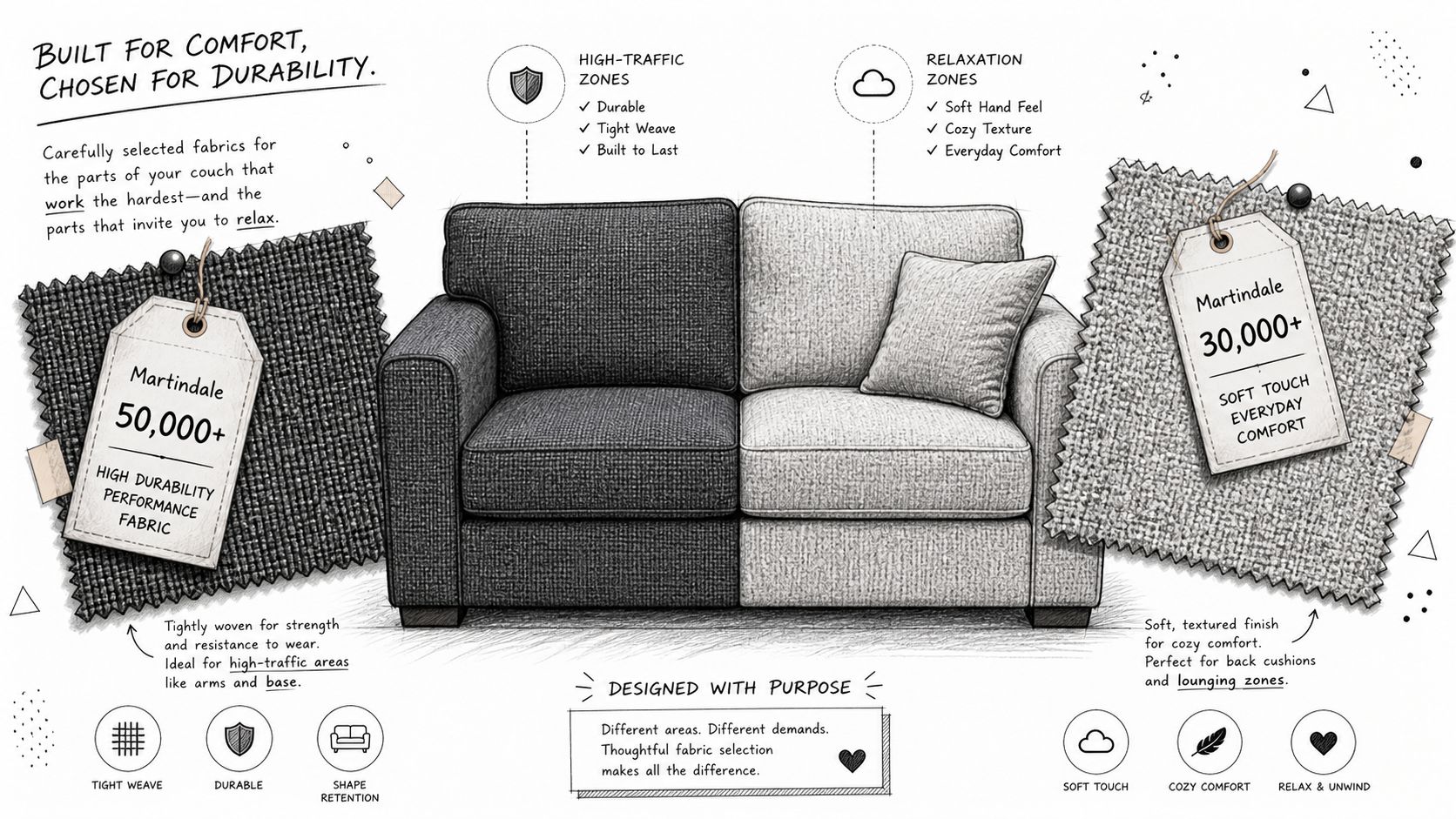
Household rule: Put the tougher, darker, or more textured fabric where bodies land first. Put the lighter fabric where eyes land first.
Sizing and Placement in Small or Multifunctional Rooms
In a studio or guest room, the sofa has to earn its footprint. That starts with clear measurements, not color. Check the doorway, stair turn, and elevator opening before you fall in love with a frame, because a sleeper that looks modest online can become awkward once you start moving it through a narrow path.
The placement matters once it’s in the room. Leaving a small gap of 6 to 12 inches from the nearest wall helps the couch feel intentional rather than shoved in place. In a room that does double duty, that little bit of breathing room can make the difference between a cramped layout and a planned one. If the couch opens for sleep, keep traffic lanes wide enough that people can still move around it when it’s extended.
Where the tones should sit
Put the darker tone on the outer arm or chaise if you want the layout to feel grounded. Let the lighter tone face the window or the inner corner if you want the room to feel brighter. That small decision changes how the sofa sits inside the room, especially when natural light hits one side more than the other.
A sectional can help with zoning when the room needs a living side and a sleep side. A reversible chaise gives you flexibility if the room changes later, and a back-to-back console setup can help define space in open-plan lofts. For size planning, sizing charts are useful before you order anything bulky, especially if you’re comparing sofa beds, futons, and sectional sleepers.
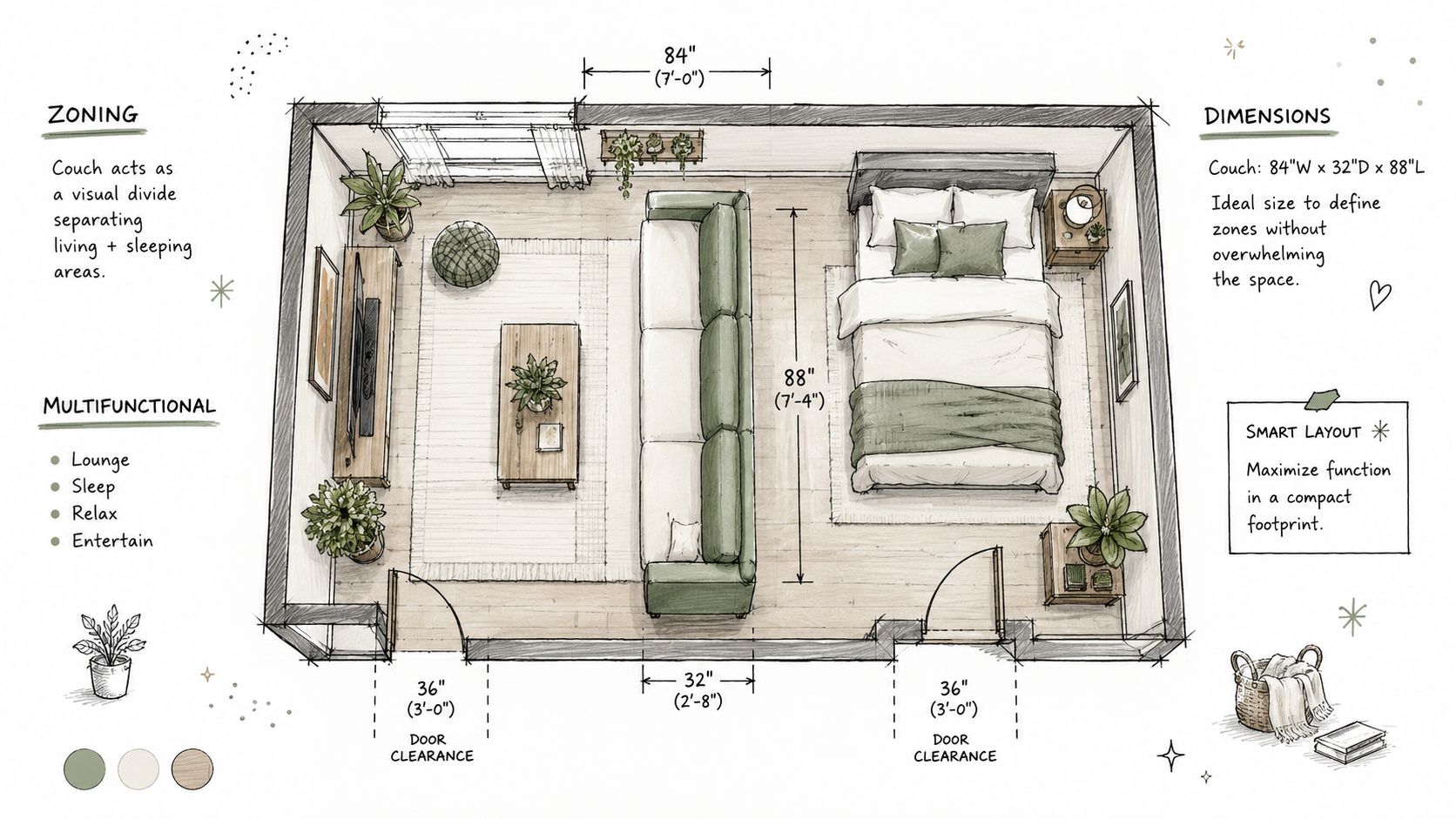
In a small room, the best-looking couch is the one that still leaves you a path to the bed, the closet, and the kitchen. If the sleeper function gets used often, that should guide the placement before the palette does.
Matching Two Tone Looks to Futonland Frames
Frame type changes how a two-tone palette reads in the room. A convertible sleeper has more visible surface in motion, so the contrast can feel more defined. A futon sits lower and looks lighter, so the same colors read more relaxed. A sectional sleeper has enough bulk to carry a stronger split without looking crowded.
Frame type by use case
| Frame Type | Best Two-Tone Direction | Ideal Household Use Case |
|---|---|---|
| Convertible sleeper sofa | Classic body-and-cushion contrast | Guest rooms and everyday living rooms |
| Futon | Soft neutral body with wood or black frame accents | Studios and compact spaces |
| Sectional sleeper with storage | Stronger body split or chaise contrast | Family rooms with extra bedding needs |
Convertible sleepers work well with a classic body-and-cushion contrast because the opening mechanism already creates a clear visual break. If the sofa opens often, keep the main seat in a muted neutral and let the contrast sit on the backrest or cushion set. That keeps the piece coordinated both folded and open.
Futons call for a lighter touch. Their lower profile pairs well with warm white, soft earth tones, or other quiet shades, especially when the frame uses wood or matte-black arms. If you want the structure itself to carry part of the look, Futonland also offers futon frames that make the contrast happen on the frame instead of only the upholstery.
Sectional sleepers can handle a heavier visual weight. Charcoal, oatmeal, and another grounded accent tone work well here because the larger shape can hold stronger contrast without feeling busy. Storage bases help keep bedding out of sight, so the color story stays tidy even in a room that does more than one job.
For nightly use, start with the mechanism, then choose the color split. Click-clack frames fit occasional guests, while full extension sleepers make more sense for regular sleep setups. If the tones wrap tightly around the seat platform, slimmer mattress profiles usually keep the proportions cleaner in a small room or a family space.
Keeping Both Tones Looking New
The lighter tone usually asks for attention first. It shows dust, soil, and color transfer sooner, especially on cushions and arm tops where hands and clothing touch most often. The darker tone hides scuffs better at the base, but it still needs regular care so dirt does not settle into seams or textured weave.
A simple weekly routine works better than waiting for a deep clean. Vacuum the lighter panels first with an upholstery attachment, then move to the darker sections so grit does not travel back onto the clean areas. If the fabric code is W, use a microfiber cloth with a water-based upholstery cleaner. If it is S, use a solvent-safe product. If it is W/S, either method can work. X fabrics should stay with vacuuming or brushing only.
Small habits that keep the contrast even
- Rotate cushions regularly: this helps one tone avoid flattening faster than the other.
- Flip throw pillows: the side facing the window can fade differently from the side facing the room.
- Swap zippered covers when possible: if one panel starts to look older, a cover refresh can rebalance the whole sofa.
- Watch sun exposure: if one tone sits near a bright window, use curtains or blinds to limit uneven fading.
- Protect high-contact zones: a throw over the chaise or a pet blanket on the arm can reduce claw wear without hiding the design.
Season by season, check whether the lighter tone is changing faster than the darker one. If it is, move the sofa a little farther from direct sun or change which cushion sits in the brightest spot. Small adjustments keep the two-tone look crisp without making cleaning feel like a full-time job.
Buying Checklist and Quick Answers
Before you buy, run through the details that affect daily use more than the showroom display does.
- Frame type: choose a convertible sleeper, futon, or sectional sleeper based on how often the bed will be used.
- Mechanism: match click-clack, folding, or full extension to the kind of guests you host.
- Mattress feel: check whether the sleep surface is meant for occasional or regular use.
- Fabric rating: ask for the Martindale range and compare it to your household pattern.
- Cleaning code: confirm whether the upholstery is W, S, W/S, or X before you assume spot cleaning will be easy.
- Colorfastness: make sure the lighter tone won’t fade too quickly near a window or high-friction arm.
- Storage: if bedding lives in the sofa, look for hidden storage or an easy-access base.
- Cover options: if you want to change the look later, check whether replacement covers are available.
| Room Profile | Best Futonland Frame | Recommended Tone Pairing |
|---|---|---|
| Small studio | Futon | Light neutral body with a deeper accent on the frame or cushion |
| Guest room | Convertible sleeper | Neutral main body with a contrasting back or seat panel |
| Family room | Sectional sleeper with storage | Grounded main tone with a darker chaise or arm accent |
Does a two-tone couch look dated? Not when the contrast is quiet and the materials feel current. The format itself is long-running, and it works especially well when the colors reflect the rest of the room instead of chasing one loud trend.
How do you coordinate it with wood floors and wall color? Match the undertone first. Warm wood usually sits well with earthy neutrals, while cooler floors can support slate, charcoal, or soft gray.
What split ratio looks best? The 60/40 balance from the earlier section is a safe guide when you want the piece to feel steady instead of chopped up.
Do pets damage contrast panels more? They can, especially on light cushions and smooth seat fronts, so put the tougher fabric where claws and paws land most often.
How do convertible sleepers keep the tones aligned after folding? They work best when the contrast is planned around the fold line instead of fighting it, which is why the body-and-cushion layout usually looks the cleanest.
For a first-time buyer, the decision usually comes down to this. Small room plus occasional guests points toward a futon or compact convertible. Family use plus everyday sleeping points toward a sectional sleeper with storage. If you want a piece that handles both seating and overnight use without overwhelming the room, choose the frame that fits the room first, then let the two-tone palette support that choice.
If you’re comparing options right now, measure the doorway, decide how often the bed will be used, and pick the frame that leaves the clearest path in the room. Then choose the two-tone pairing that fits your light, your flooring, and the panel you’ll touch most.