Stylish Blue Storage Cabinets for Your Home
You’ve probably already done the fun part. You found a blue cabinet online, saved six versions to your phone, and now you’re trying to decide whether you want a deep navy statement piece, a softer dusty blue chest, or something brighter that feels a little more playful.
That’s usually the point where the practical questions start. Will the finish look cheap in person. Will it show every fingerprint. Will a tall cabinet make a small bedroom feel tighter. And if you live in a New York apartment, will it earn its floor space.
Blue storage cabinets can absolutely work. The key is choosing the right shade, the right material, and the right shape for the room you have, not the oversized one in the inspiration photos. A good blue cabinet adds color without feeling loud, and storage without feeling bulky. A bad one looks great in a product shot and disappointing by week two.
Why Blue Storage Cabinets Are a Timeless Choice
Blue feels current, but it’s not a new idea in storage furniture. That matters, because some colors read like a short trend cycle and others stick because they solve a design problem well.
Blue does a few useful things at once. It adds color, but it’s usually easier to live with than bright green, red, or yellow. It can act like a neutral in some rooms, especially when you choose muted tones. And it works across styles that people mix in real apartments, from coastal to mid-century to Scandinavian to traditional.
Blue has real design history
The appeal of blue storage cabinets isn’t just social media styling. The earliest verified production of steel kitchen cabinets in 1926 included patriotic red, white, and blue color schemes, and blue became part of the language of modern, sturdy, space-efficient storage as those cabinets evolved in American homes (Retro Renovation’s history of metal kitchen cabinets).
That history still tracks with what buyers want now. Blue can feel solid, clean, and intentional. It doesn’t have the severity of black, and it doesn’t disappear the way plain white often does.
Blue works when you want a cabinet to be visible, but not shouty.
It adapts to the room instead of fighting it
A navy cabinet can anchor a room the way a dark wood dresser would. A slate blue cabinet can soften a room full of straight lines. A brighter blue piece can wake up a neutral rental without requiring paint on the walls.
That flexibility is why blue storage cabinets keep showing up in bedrooms, living rooms, entryways, and dining corners. The color gives you personality, but the piece can still handle ordinary jobs like folded clothes, extra bedding, chargers, paperwork, or guest linens.
It suits small apartments better than people think
In NYC, color has to pull its weight. If you’re adding one more storage piece to a compact room, it can’t just be pretty. It has to improve the layout or at least justify the footprint.
Blue is good at that because it can read decorative and practical at the same time. A cabinet in the right tone can feel like furniture, not just utility storage. That matters in studios and one-bedrooms where everything is visible all the time.
From Navy to Slate A Guide to Blue Cabinet Tones
Not all blue storage cabinets do the same job. Shade changes mood, how formal the piece looks, and what finishes around it will make sense.
Choosing Your Blue Tone, Mood, and Perfect Pairings
| Blue Tone | Creates This Mood | Best For These Styles | Pairs Well With |
|---|---|---|---|
| Navy | Grounded, polished, tailored | Traditional, coastal, transitional, modern classic | Brass, walnut, warm white, cream, leather |
| Slate blue | Calm, architectural, understated | Scandinavian, modern, soft industrial | Black metal, oak, linen, gray, stone |
| Dusty blue | Relaxed, airy, softer look | Japandi, cottage, casual contemporary | Ash wood, beige, ivory, matte ceramic |
| Bright blue | Energetic, playful, graphic | Eclectic, kids’ rooms, bold modern spaces | White, light oak, chrome, simple shapes |
Navy for structure
Navy is the safest choice if you want blue but still want the piece to feel substantial. It has the same visual authority as espresso or charcoal furniture, but it feels fresher.
Navy works especially well when the cabinet has classic lines, framed drawer fronts, or brass hardware. In a bedroom, it can replace the need for another dark wood piece. In a living room, it can make media clutter look more intentional.
What doesn’t work as well is pairing navy with too many other heavy finishes at once. If you already have dark floors, a black metal bed, and a dark gray sofa, navy can tip a room into feeling dense unless you add lighter textiles and some contrast.
Slate blue for a cleaner look
Slate blue is useful when you want color without a strong theme. It sits in that nice middle ground where it feels cooler than beige but quieter than navy.
This shade tends to work well in apartments with white walls, light wood flooring, and simple upholstery. It’s especially good if your room already has black accents, because slate blue usually gets along with black frames and matte hardware better than warmer dusty tones do.
Practical rule: If you’re nervous about committing to blue, start with slate. It’s often the easiest version to place.
Dusty blue for softness
Dusty blue has more gray in it, sometimes a little softness that reads almost vintage. This is the shade I’d choose when a room needs storage but not another sharp-edged visual block.
It pairs especially well with natural oak, woven textures, off-white bedding, and simple ceramics. If you like Japandi or Scandinavian rooms that feel collected rather than decorated, dusty blue usually makes more sense than a high-gloss navy.
The trade-off is that dusty blue can look tired if the finish quality is weak. On cheap MDF with a flat, chalky paint layer, it can read dull instead of subtle.
Bright blue for energy
Bright blue is more specific. It’s not the universal choice, but when it works, it looks great.
Use it in smaller doses, like an accent cabinet in an entry or a compact storage piece in a home office nook. Bright blue looks best when the silhouette is clean and the room around it is restrained. If every other piece is already trying to be a moment, bright blue becomes too much very quickly.
What Is Your Cabinet Made Of Quality and Durability
Color draws people in. Construction decides whether the cabinet stays in your home.
A lot of disappointment with blue storage cabinets has nothing to do with blue. It comes from weak materials, thin paint, bad drawer hardware, and door fronts that look smooth online and uneven up close.
Painted solid wood
Painted solid wood is usually the most satisfying option in person. It tends to have better edge definition, a deeper finish, and a sturdier feel when you open drawers or doors.
It’s also the material that usually ages with the most dignity. Small wear marks can look like normal use instead of damage, especially on pieces with a more traditional or handcrafted style.
The trade-off is price, and sometimes movement. Wood can expand and contract a bit with climate changes, so a painted solid wood cabinet may develop the slight character lines people notice around joints over time. That’s not necessarily poor quality. It’s part of how real wood behaves.
Wood veneer over engineered core
A good veneer cabinet can be an excellent middle ground. You get a more stable structure than all-solid wood in many cases, and the finish can look quite refined if the manufacturer does the color work well.
Veneer works best when the cabinet design is clean and the visible grain or surface consistency matters. For blue finishes, though, execution is everything. If the coating is thin or uneven, corners and edges can tell on the piece fast.
This category is where I’d pay close attention to details like:
- Edge treatment: Sharp, fragile-looking edges chip sooner.
- Drawer operation: If the glide feels rough in a showroom, it won’t improve at home.
- Back panel quality: Thin, flimsy backs usually signal cost cutting elsewhere too.
MDF and laminate
MDF and laminate have their place. They can deliver a smooth painted look at a lower price, and some laminated finishes are easier to wipe down than lower-grade paint.
But there’s a range here. Better versions look crisp and consistent. Cheaper ones can swell at edges, ding easily, or show seam lines in ways that make the cabinet feel temporary.
This matters even more with dark and mid-tone blues. According to Hunker’s discussion of blue cabinets, 41% of returns on dark-colored case goods are due to poor cleanability and showing marks in high-use areas, compared with 15% for neutral finishes. If you’re buying for a family room, guest room, or heavily used bedroom, a wipeable finish is not a minor detail.
The finish that looks moody and elegant in a photo can look dusty, streaky, or scratched in real life if the surface quality isn’t there.
Hardware and joinery matter more than people think
A cabinet can have a beautiful blue finish and still feel cheap if the hardware is weak. Check the hinge action. Open the drawer all the way. Look at the interior.
What usually works better:
- Smooth hinges: Doors should open evenly and sit flush when closed.
- Substantial drawers: You want a drawer box that feels stable when loaded, not one that racks side to side.
- Clean paint around handles: Sloppy paint buildup near hardware is a red flag.
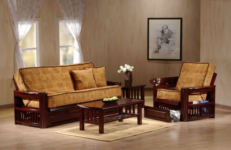
If you’re comparing storage with other room pieces, it helps to match quality levels. For example, a cabinet with a durable painted wood build will usually sit more comfortably beside substantial pieces like hardwood futon frames than a very lightweight case good with a paper-thin finish.
Smart Storage for Small Spaces Especially NYC Apartments
In a city apartment, storage furniture has to solve a layout problem. That means thinking beyond color and asking what form will help the room.

A useful clue comes from buyer behavior. 62% of NYC renters prioritize color-matched storage under 30" deep for multifunctional use, according to Wayfair’s blue cabinet listings and trend context. That tracks with what works in apartments. People don’t just want storage. They want storage that fits around beds, sofa beds, desks, and narrow walkways.
Chest, dresser, or cabinet
These pieces are not interchangeable.
A bedroom chest is usually the best move when floor space is tight but wall height is available. It gives you vertical storage with a smaller footprint. In a narrow bedroom, that often matters more than having a long low dresser.
A dresser works better when you have a wider wall and want surface area for a mirror, tray, lamp, or TV. In a compact room, though, a wide dresser can eat visual space fast.
A door cabinet or accent cabinet makes sense when what you’re storing is irregular. Think extra bedding, chargers, board games, office supplies, or guest items that don’t stack neatly into drawers.
Measure the room like a renter, not a showroom
People often measure the wall and stop there. That’s not enough.
Check these before you buy:
- Walking clearance: Leave enough room to pass comfortably when drawers or doors are open.
- Door swing: A cabinet door that opens into a bed corner gets annoying immediately.
- Sightline: Tall and dark pieces look bigger when they sit directly in your first line of view from the doorway.
- Delivery path: NYC buildings punish optimistic measuring. Check stairs, elevator depth, hall turns, and entry doors.
Go vertical, but keep the shape calm
Vertical storage works well in studios because it preserves precious floor area. But not every tall cabinet belongs in a small room.
Look for a shape that feels visually contained. Legs can help a cabinet feel lighter. So can a slimmer depth and cleaner front. Heavy crown molding, thick sidewalls, and oversized bases can make even a practical cabinet feel bulky.
For apartments where one room has to handle sleeping and hosting, blue cabinets often make the most sense when they relate to another multifunctional piece instead of floating as a random accent. That’s especially true if you’re pairing storage with compact guest solutions such as murphy cabinet and chest beds.
How to Style Blue Cabinets in Any Room
A blue cabinet looks best when the rest of the room acknowledges it. You don’t need to match everything. You do need to make it feel chosen.
In the bedroom
A navy or dusty blue chest in a bedroom does well with quiet support. White or ivory bedding, a wood nightstand, and one warm metal note usually does the job.
Don’t over-theme it with more blue everywhere. A single blue cabinet plus one small callback, maybe a pillow stripe or artwork detail, feels more intentional than matching the entire room to the cabinet.
In the living room
A blue storage cabinet in a living room can either ground the space or lighten it, depending on tone.
A navy piece works well under art, next to a cream sofa, or along a wall with oak and black accents. A slate blue cabinet tends to disappear a bit more, which is useful if the room already has enough visual movement from rugs, books, and media.
If the cabinet color is rich, keep the styling on top simpler than you think. A lamp, a bowl, and one stacked object often looks better than ten small accessories.
In the entryway or dining corner
Brighter or more decorative blue storage cabinets can shine in such settings. They don’t have to carry the whole room, so they can be a little more expressive.
Try a blue accent cabinet with:
- Natural pottery: It softens saturated color.
- A mirror above: Good for bounce and function in narrow spaces.
- One warm material: Rattan, oak, or leather keeps blue from feeling cold.
If you’re leaning coastal but want to avoid the obvious beach-house look, it helps to study rooms that use blue alongside texture, white space, and natural finishes. DreamKitchen.ai’s guide to a Coastal Kitchen is useful for that balance, even if you’re styling a cabinet outside the kitchen.
Hardware changes the read
Brass makes blue feel warmer and more classic. Black hardware sharpens it. Chrome and polished nickel can make bright or cleaner blues feel crisper.
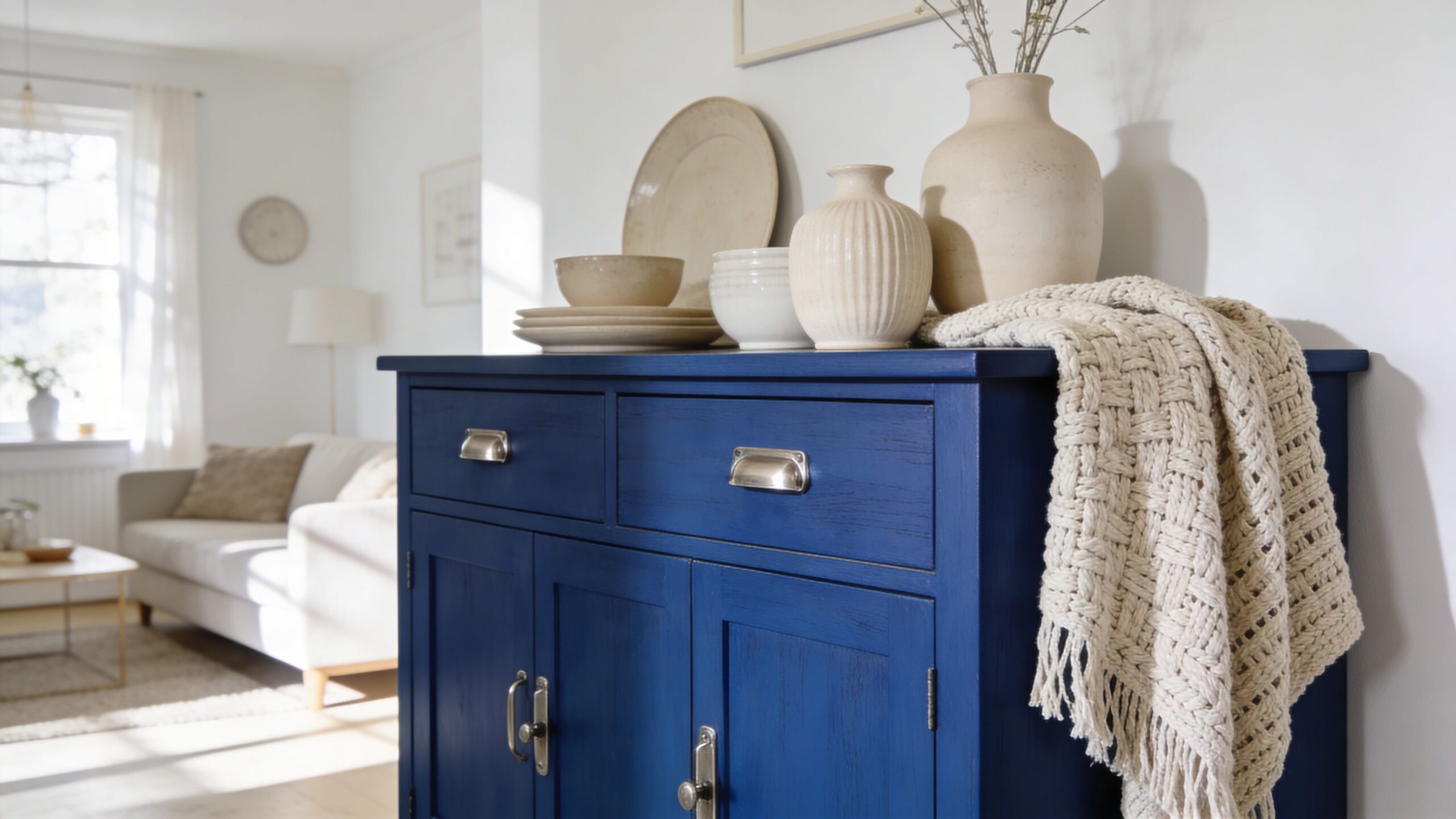
Small decorative choices matter too. A blue cabinet topped with matte ceramics and a folded textile feels softer. The same cabinet with glass, polished metal, and angular lighting feels more refined. If you want to layer in those smaller finishing pieces, decor and home accents are often what pull the cabinet into the room instead of leaving it as a standalone item.
See the Quality In Person Futonland's Blue Storage Options
Blue is one of those finishes that benefits from an in-person look. Screen brightness changes it. Studio lighting changes it. So does the surface itself. A blue that looks deep and elegant online can read flat, purple, or overly glossy in person.
That’s why seeing case goods before buying is useful, especially if you care about finish depth, hardware feel, and whether the piece looks substantial enough for everyday use. Futonland carries bedroom chests, storage cabinets, and case goods in a range of styles, including blue-toned options, and its NYC stores give shoppers the chance to inspect those details directly instead of guessing from a product photo. Store information is available at Futonland store locations.
A showroom visit helps answer the practical questions that listings often don’t. Does the drawer front feel solid. Is the paint smooth around the edges. Does the blue lean gray, green, or true navy under normal light.
That matters even more in apartments, where each furniture piece has to work harder and look intentional from every angle.
Keeping Your Blue Cabinet Looking Its Best
Blue finishes look great when they’re clean. They also reveal neglect faster than many wood tones, especially darker shades.
A few habits help:
- Dust with a soft dry cloth: Fine dust shows up quickly on navy and slate finishes.
- Use a damp cloth, not a soaking one: Painted wood and MDF both do better when moisture stays controlled.
- Skip harsh cleaners: Abrasive sprays can dull painted finishes and leave streaks on laminate.
- Wipe spills early: Rings, drips, and hand oils are easier to remove before they sit.
For minor wear, a furniture-safe touch-up product that matches the finish can help, but always test first in a hidden spot. Keep blue cabinets out of prolonged direct sun when possible, since fading can show unevenly across doors and top surfaces.
If you’re refreshing an older painted piece instead of buying new, a practical guide on how to paint kitchen cabinets can help you understand prep, sanding, and finish expectations before you start.
Your Blue Cabinet Questions Answered
Are blue storage cabinets still in style
Yes. But beyond aesthetics, they’re usable. Blue has enough range to work as a quiet neutral or a focal point, which gives it staying power beyond trend cycles.
Can you mix different blues in one room
You can, but keep the undertones consistent. A dusty gray-blue cabinet and a bright cobalt rug often fight each other. A navy cabinet with softer blue textiles usually works better.
What hardware looks best on blue cabinets
It depends on the shade. Brass warms navy and dusty blue. Black works with slate and modern darker blues. Chrome suits cleaner, brighter blues and more contemporary rooms.
Do dark blue cabinets always show dust
They often show more dust and marks than lighter finishes. That doesn’t mean avoid them. It means choose a better surface and expect routine wiping in busy rooms.
Is a chest better than a dresser in a small bedroom
Often, yes. A chest uses height instead of width, which usually fits better in tighter layouts and leaves more open floor area around the bed.
If you’re choosing among blue storage cabinets, treat color as the starting point, not the whole decision. Shade sets the mood. Material determines how the finish will look after real use. Shape decides whether the piece helps or hurts the room. In a small apartment, the right cabinet does all three well.